***
Back to Mies (not Miers) and IIT: one of the most interesting buildings on IIT's campus was OMA principal, Harvard GSD professor and Pritzker Prize-winner Rem Koolhaas's McCormick Tribune Campus Center, which is the new student center. Because of the campus layout, Koolhaas had to site the building partially beneath Chicago's Green Line El tracks, so he devised an ingenious solution, which was to wrap the tracks in a huge sound-dampening tube, and then curve the roof of the center under the tube, while grading the space beneath the roof so that once inside the building, the dip in the roof isn't as noticeable. I was curious to see this, so I went into the building, walked around, snapped pictures, and I can say it is a marvel. The only other Koolhaas building or space I've ever been in is the Prada Store in New York's Soho, which was a revelation when I first visited it, with its marvelously sloping floor, step-benches, liquid screens, and so on. I have not seen the new library in Seattle, but hope to one of these days. This building uses color, unanticipated angles and spaces, shifting sightlines, dispersed spaces for congregation, and a rich mixtures of colored glass, buffed metals and concretes, and advanced plastics, to create a space that feels both profoundly futuristic and virtual--it's almost like the embodiment and performance of Deleuze and Guattari's concept of "smooth space," but not merely as concept, but at experienced, situated, temporally grounded space.
Here are some photos of this center, which I think is one of the most interesting college or university buildings I've been in (some of my favorites were at MIT, though that was before they had begun their new wave of buildings that includes the Gehry, Holl and other masterpieces).
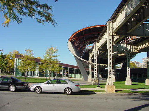
The tube(s), and the slanted (side) façade and entryway of the McCormick Tribune Campus Center
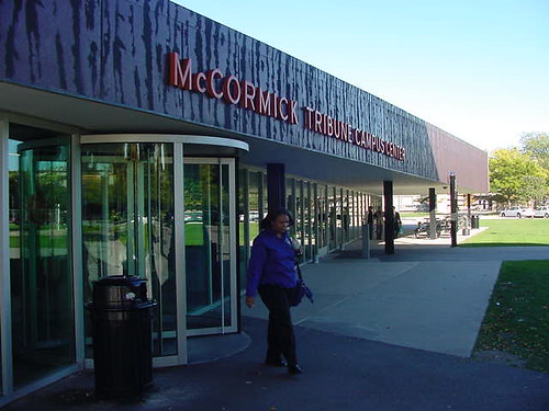
The side entryway up close. The tube hovers behind me. The slanting roof is hardly perceptible from this vantage.
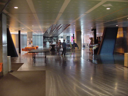
The game room area, with the shimmering floor, the defamiliarizing angles, and the flowing contrasts of light and color.
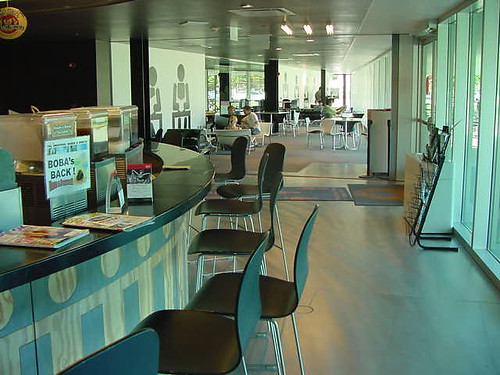
There's a juice bar/café, with an aquamarine color motif, as well as the recurrent human symbols that appear all over the building, including on the glass walls facing State Street, where from a distance they form coherent images
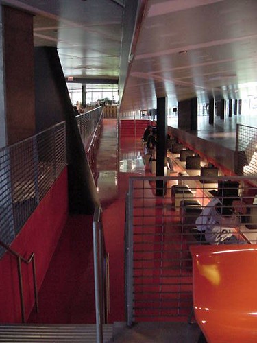
The pumpkin-colored computer bank (which only featured PCs). The photo hardly captures the dramatic lines and color of this space.
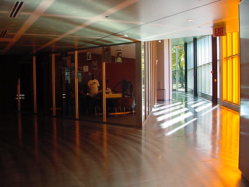
The radio station, and the space behind the State Street façade, with its orange-tinted windows. The orange light was almost spellbinding, but this photo hardly does it justice.
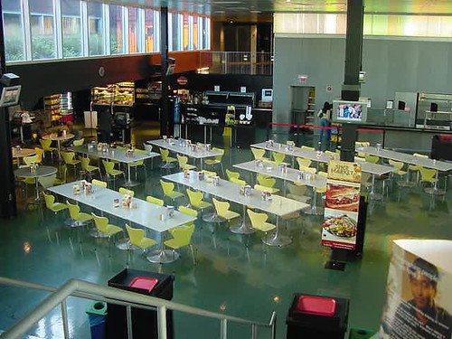
The multicolored, multifloored cafeteria. Again, the photo hardly does it justice, since there are multiple spaces that constitute it, and depending upon where you are, you might be looking out onto or down or up into another area altogether.
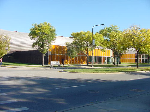
A view of the State Street façade, with its orange-tinted windows. The slanted roof again has become invisible, though the Tube hovers in the background above the center of the building.
I'll end here. Koolhaas is about 60 or so, and has a number of projects underway, but I sincerely hope he gains or wins commissions for other US buildings. This one is hardly as experimental and dramatic as either the Prada Store or the images I've seen of the Seattle Library, but it's still a gem.

Ooh . . . Cool pics!
ReplyDeleteHow exciting - thanks John! I love Koolhaas' juxtaposition of industrialism and humanism. Beautiful how he turned a design constraint (the El) into a pivotal focal point. Sure, the student center does not manifest the drama of the Seattle Public Library or the stunning boldness of the CCTV headquaters project in Beijing. Yet it's these smaller-scale projects - where Koolhaas cannot overwhelm us with raw scale - that his optimism for a global urban vision has to come through. And he mos def succeeded here.
ReplyDeleteI am VERY anxious to see the Seattle Library! I was in their previous building which was a prime example of a 1970's-style functional civic building...zzzz. Rem's building is far from that, although I have heard some carping about how it looks better than it works as a functioning building....I want to see for myself.
ReplyDeleteGreat photos John -- keep it up!
Treasure, thanks for stopping by! You know I peep your blogs all the time too!
ReplyDeleteZun, a great point about Koolhaas's juxtapositions and how the constraints of scale actually worked in his favor in this building. I'm going to look for images of the CCTV HQ online. I also love what I've seen of some of his other small buildings like the Maison à Bordeaux, and the Kunsthal in the Netherlands, which has the same sort of ramped, shifting floors as this building. Both have been highly praised. I especially love his use of colors, which may date, though right now they give off a feeling of being utterly in the future, which I guess is another way of saying they're effectively utopian....
Reggie, is the Seattle PL building not functioning so well? I'd read that he'd discussed some of his innovations with the librarians, but I guess it's one thing to theorize and another thing to see how systems actually work under real-time conditions. The building just looks SO amazing. I've never been to Seattle, and that is high on my list of must-see buildings there.